Website for YAHAMA music
To attract the target audience of training courses, I created a website in youth style.
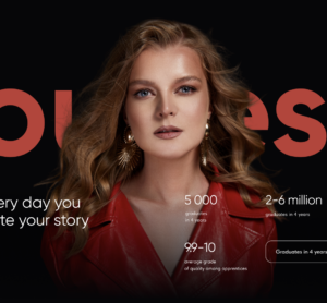
Through the design of the site, it was important to convey that our client offers training in a modern and interesting format. To keep the landing page from looking too strict, I added soft shadows of orange-blue gradients to the black background. These areas make the picture more lively and attractive.
The site uses bright orange and blue buttons and drawings of imaginary students. Blue is associated with the ink of pens used to write at school. This shade helps convey the atmosphere of the learning process.
The site contains a minimum amount of text. For writing the main information blocks, a classic white font was chosen, which is easy to read from any device. Headings are in sharp blue letters.


Comments